Schneps Events Experience Redesign

The Power of Web UX/UI Design in Evolving Event Search Experience

Project Overview

Schneps Media, a community-centric media company, runs targeted events through Schneps Media Events to foster local connections and business growth. However, the existing events page on their official website struggles with user engagement. Clicky heatmaps highlight a notable lack of clicks on the "View Events" buttons, and feedback from users indicates challenges in quickly finding local events.

The redesign project seeks to transform this page, merging aesthetics with functionality, ensuring users can effortlessly locate and engage with local events.
Duration
2 Months
Tools
InVision | InVision Studio | WordPress | HTML & CSS
Keywords
UI/UX | Web Dev | Responsive Design

Project Plan

Discover
Understand Context of Use
Heuristic Evaluation
User Research
Competitor Analysis
Define
Problems Definition
Design Opportunities
Feature Prioritization
Design
Redesign & Wireframing
Usability Testing & Iteration
UI Components Design
Prototyping
Usability Testing & Iteration
Deliver
Programming
Content Entry
Project Delivery

Heuristic Evaluation

In a heuristic evaluation of the task to explore upcoming weekend events in Manhattan on the Schneps Media Events website, 3 major issues were identified:
Issue 1: Time-consuming to find relevant events
- Severity: 3
- Violation: Help; Efficiency of Use
- Suggestions: Event searching / filtering / sorting to filter out unwanted results
Issue 2: Overwhelmed by long text & large images
- Severity: 3
- Violation: Minimalist Design; Help
- Suggestions: Prioritize key content and redesign layouts to support primary goals
Issue 3: Non-responsive website
- Severity: 4
- Violation: Consistency & Standards
- Suggestion: Layouts dynamically change with screen size to display oveflow content

User Research

In my user research for the Schneps Events web experience, I employed methods such as user journey mapping and cognitive walkthroughs to gain insights into the usability and functionality of the platform. The target users for this research are entrepreneurs, event sponsors, and nominators—key stakeholders who are expected to frequently engage with the website.
User journey mapping allowed me to visually depict the entire process a user goes through while interacting with the site, from initial entry to completing specific tasks, such as nominating an event or finding sponsorship opportunities.
From the user Vanessa's journey throughout the event exploring process, two pain points are identified:
1. Event venues are not listed on the event listing page. Users have to switch between tabs to compare events.
2. Users do not have the options to search for a specific event or find activities of specific dates and locations.
Cognitive walkthroughs, on the other hand, enabled me to evaluate the ease with which these specific user groups could accomplish their goals, which is to find a local event in the neighborhood and purchase a ticket in this context. A few issues including wordy text, lack of search or filter functions, readability of the content are reflected.
These research methodologies provided valuable data for pinpointing areas that require improvement to enhance user engagement and task completion rates.

Competitor Analysis

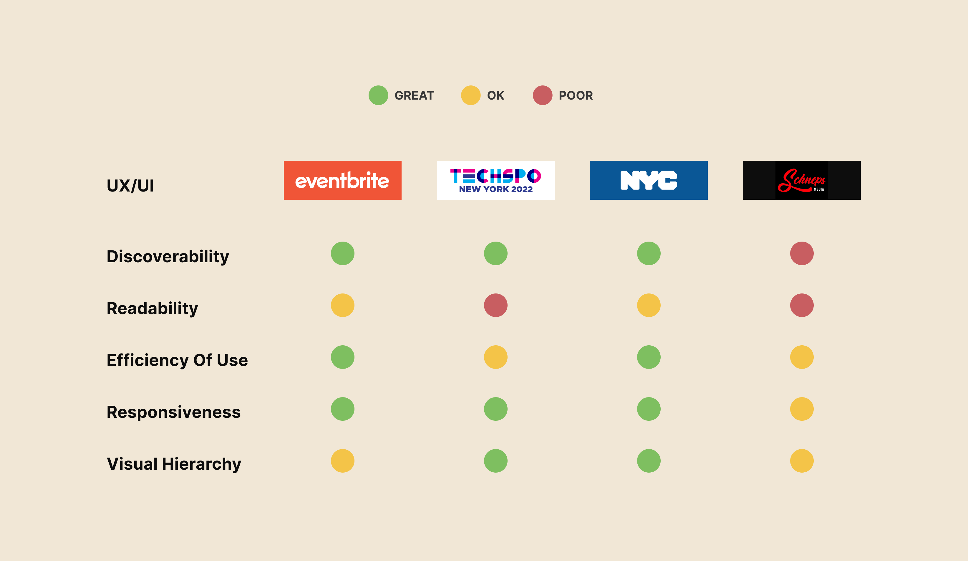
The Schneps Events website was evaluated alongside similar platforms like Eventbrite, NYC, and TECHSPO, focusing on key user experience metrics such as discoverability, readability, efficiency of use, responsiveness, and visual hierarchy.
The analysis revealed that platforms like Eventbrite excel in discoverability through federated, faceted, and fast search functionalities, allowing users to easily find events that interest them. In terms of efficiency, competitors generally displayed more list items per page and provided all key information within one list, along with options to narrow down choices—features that Schneps could adopt for improvement. High readability and visual hierarchy were observed in platforms that used sufficient spacing between blocks, and shorter paragraphs, larger and heavier fonts, color contrasts, and icons to highlight key information. Additionally, high responsiveness across different screen sizes was a standard feature among the competitors, ensuring a consistent and adaptive layout. These key takeaways serve as benchmarks for creating an optimized event exploring experience on the Schneps Events website.

Problem Definition

Design Problems of Current Website
Poor Discoverability
Overwhelming Content
Non-Responsive Design
Poor Visual Hierarchy
User Problems from User Research
Wordy & Repetitive Content
Missing Key Information
Inefficient Event Discovery
Hidden Overflow Content
Problem Statement
How might we create a more engaging event listing webpage that allows our users to explore the events in their communities in a more efficient way?

Design Proposals

design opportunities
Event Searching/Filtering/Sorting
Better Visual Hierarchy
Simplify Web Content
Responsive Layouts
feature prioritization

Wireframes

events page wire-framing
Key changes for events listing page:
- Restructure the visualization
- List items in smaller size
- Only display event title, date,  location, & thumbnail image
- Large fonts for dates and event titles
- Add filters & search bar
Key changes for event details page:
- Remove repetitive contents
- Quick launch navigation stick at the top
- Consistent design
filter & search bar design options
In the redesign project for the Schneps Events website, special attention was given to the filter and search bar functionalities—crucial elements for enhancing user discoverability and engagement. Multiple design options were explored to ensure that the search and filter bar is not only intuitive but also aligns with the needs of our target users: entrepreneurs, sponsors, and event nominators.
in-house testing & Finalized Wireframes
During our in-house testing, it became evident that users urgently needed the ability to filter events by location. Moreover, adding event descriptions was suggested to improve the efficiency of discovery.
Addressing these needs, the final wireframes were designed with simplified, location-based tag filters instead of the complicated filtering system. Additionally, we introduced interactive list items where users can expand event cards to view more information, providing a seamless and informative browsing experience without overwhelming the interface.

Style Guides

Prototypes

grid layout
Prototypes & Responsive Design
effectiveness of new design
A/B testing is employed to evaluate the effectiveness of the new design against the current one. Visitors were randomly split into two groups: 50% were directed to the existing website, while the remaining 50% interacted with the new design. The results were compelling—while the current design had a 21% conversion rate and fewer clicks on the "View Event" button, the newly designed website significantly outperformed it with a 38% conversion rate and increased engagement on the "View Event" button. These findings not only validated the improvements made in the redesign but also provided strong evidence of the new design's potential to boost user engagement and conversion rates.